About Client
TecSpace is an employment agency connecting Lithuanian specialists with reliable employers across Europe. The company aims to help specialists discover career opportunities abroad, ensuring a smooth employment process and professional support.
Project goals
The client approached us to create a modern and easily recognizable logo. The main goal is to visually convey the essence of the company’s activities: career path, reliability, and professionalism. A mark needed to be created that could be used in various formats—from websites to printed materials.
Creative Process
We developed several concepts focused on the symbolism of movement, path, and growth. We chose the shape of the letter ‘S’ as the main idea, transforming it into a road metaphor symbolizing career direction and a steady step forward. The design solutions were complemented by modern typography and bright colors, ensuring visual distinctiveness.


Final Result
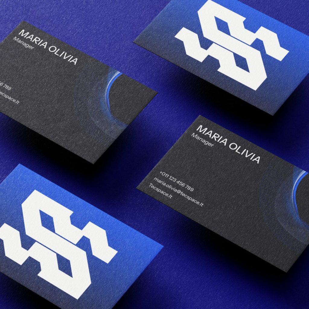
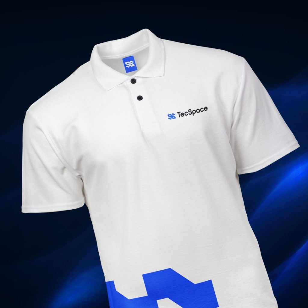
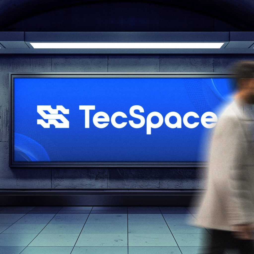
A minimalist, clear, and professional logo was created with the letter ‘S’ as a road symbol, conveying career growth and progress. The company name ‘TecSpace’ is integrated alongside, ensuring easy recognition. The chosen blue color emphasizes reliability, stability, and modernity. The logo is successfully adaptable to both digital and printed materials.

